


Yes, Logo!
Take it from my son James: insignia and emblems hold the world together, and music logos are their ultimate, pure form

25 years ago(!), I read Naomi Klein’s first book No Logo, that elegant polemic against the ubiquity of corporate branding – and the exploitation and greed that it usually embodies – that still feels like as vivid an evocation of its queasy, quietly troubled time as Radiohead’s equally queasy and troubled Kid A. I liked it as much as I did partly because of its author’s ambivalent recognition of the almost mystical power of what she was writing about, captured in a passage about her childhood:
At five or six, I would eagerly await the moulded plastic of franchise signs on the side of the road, craning my neck as we passed McDonald’s, Texaco, Burger King. My favourite was the Shell sign, so bright and cartoon-like I was convinced that if I could climb up and touch it, it would be like touching something from another dimension - from the world of TV.
I recognised that description of logomania as soon as I read it; it chimed with my own memories of the warm glow of neon-lit petrol stations and electrified cityscapes, and a lifelong fascination with the real-life pop art of insignia and emblems.
My son James has the exact-same fixation, to the point that logos are not just an obsession, but a seeming indicator of the threads and common sights that hold the world together. When he was no older than two, he developed a fascination with the branding of Premier Inns, to the point that the mere sight of its purple moon-and-stars signage would send him into momentary euphoria. He began a habit – which endures – of carefully reproducing those self-same McDonalds and Texaco logos (as well as those of Subway, KFC, Sainsbury’s and scores more) on endless sheets of paper.
When James got immersed in music logos, the magic seemed to massively intensify. As with a lot of us, there are two distinct elements to his musical likes and loves. One is to do with the main event: what he listens to. The other is the tangle of meaning and order threaded around it – release dates, record labels, discographies… and, more than anything else, the fact that an inordinate number of the artists he likes have logos, in the same way that football teams have strips. Since he was little, he has repeatedly drawn these…
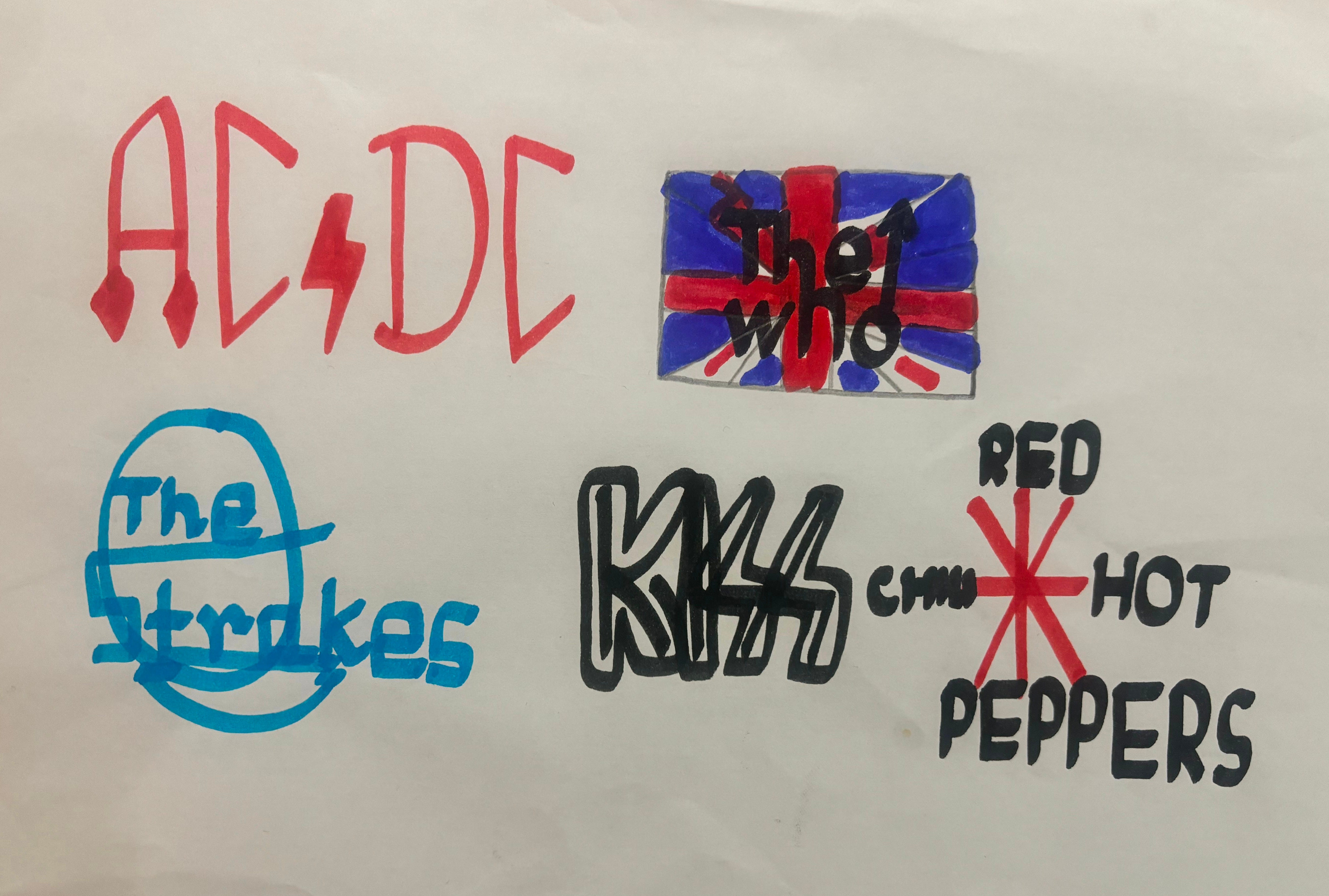
… And, thanks to a lovely kind of happenstance, the cover of Maybe I’m Amazed – by the masterful Jon Gray, done without any logo-suggestion from me – reflects this part of our shared musical interests.
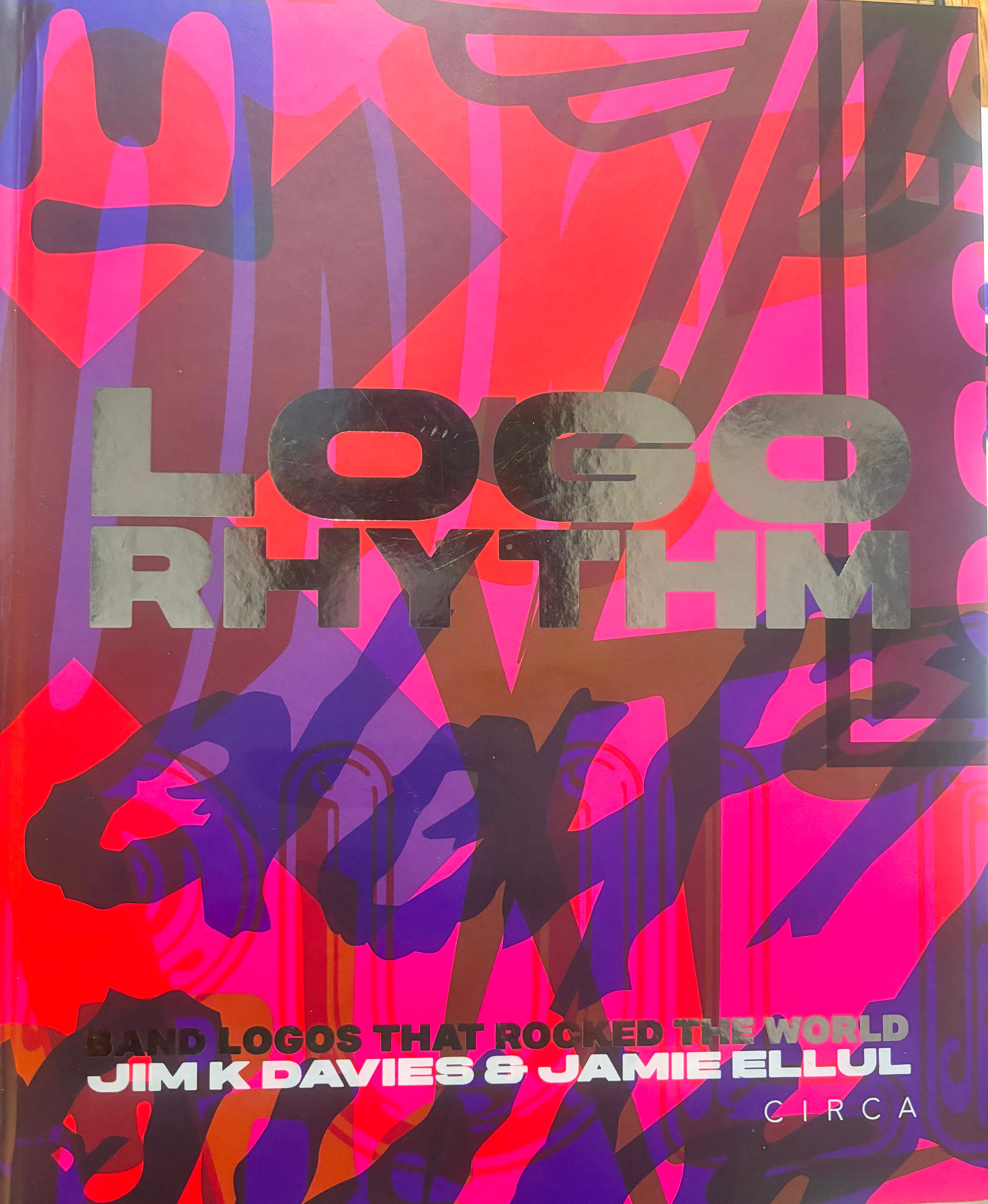
For years, I looked for a book about music logos. I - and James – had to wait an awfully long time, until the publication last year of a huge and sumptuous book titled Logo Rhythm, by the design experts Jim K. Davies and Jamie Ellul. It not only tells the story of scores of music logos – used by The Beatles, Wings, Funkadelic, the Wu-Tang Clan, AC/DC, The Beat, Nine Inch Nails, Arctic Monkeys and so many others besides – but crisply captures the strange allure the best of them possess: the same seductive, mesmerising quality Klein captured, somehow used for slightly more higher purposes than just selling us things (though that’s undoubtedly relevant). It arrived in our house for James’s 18th birthday: barely a week now goes by without one of us reaching for it, and re-reading (and re-drawing).
“Evocative, emotive and expressive, a great band logo is an exercise in supreme graphic distillation,” the authors write. “A successful band logo cannot only visually conjure up a genre, but also a musical ethos and attitude using a simple pictogram or a few thoughtfully-curated letterforms. Refined or rough’n’ready, subtle or in your face, considered or spontaneous, they are a band’s flag or calling card, a cypher for what they stand for.” Put another way, a great logo is the visual equivalent of an effective riff or hookline: a means of instant recognition that instantly lodges itself in the viewer’s memory.
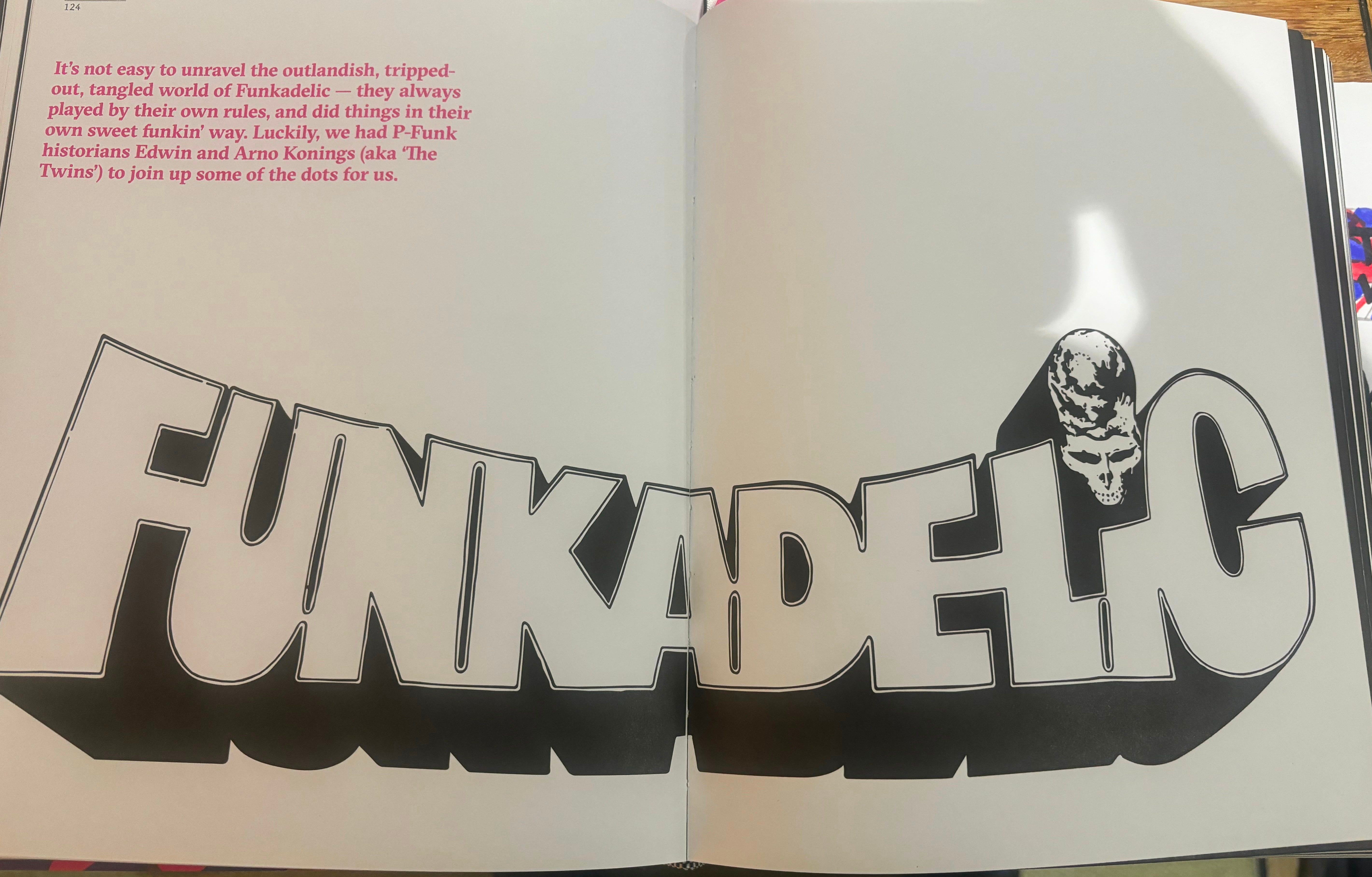
How many of us know what that means as a matter of instinct, and have felt exactly the fusion of style and content that it describes? The Sex Pistols’ yellow-and-shocking-pink emblem seems to snugly fit exactly what they represented. The same sense of minimalist, streamlined, confrontational perfection defines both the music of Neu!, and their logo. There is something in Funkadelic’s classic insignia that cuts straight to the mixture of maverick instincts, cool, and high camp that surrounds the records they made. The dropped-’T’ logo on Ringo Starr’s drumkit always seems to crystallise The Beatles’ exquisite taste and confidence and surely as their sleeve art.
I too used to doodle logos on every available surface, teaching myself to reproduce The Jam’s subway-graffiti logo without even thinking, and mastering the Two Tone Man – Walt Jabsco, he was called - after months of trying. From time to time, I still do. I know why: whatever Pop Art is, the greatest logos surely define it.
Maybe I’m Amazed is out on March 27th. Pre-order it here
Maybe I’m Amazed events
News just in: I’m doing an event in Swansea with the brilliant Jude Rogers on April 22nd… details to be announced next week.
In the meantime, I’ll be talking about Maybe I’m Amazed and what’s in it – autism, music, Kraftwerk, The Clash, Special Needs parenthood and more – at various places throughout the spring & summer. These dates are already in:
London Rough Trade Denmark Street with Miranda Sawyer, Monday March 31st 5.30pm: tickets (including a book) and details here.
Manchester Deansgate Waterstones with Dave Haslam, Wednesday April 16th, 6.30pm: everything (tickets with book and without) is here.
Rock’n’Roll Book Club in Walthamstow with Keith Cameron, Monday March 24th. Tickets available here.
There are also dates about to be announced in Sheffield and Derby: follow me on Bluesky for announcements, or check back here.
Current listening!
Tracks: I Was Neon, by Julia Jacklin (2022); Flames Shards Goo, by ML Buch (2023)
Just been introduced to this blog by your brilliant Guardian piece on Spotify today 🙏🏼 I can’t see a South West of England date on your roadshow, do you plan to put one in John? Thanks - loved this piece too and didn’t know about the recent book you reference but loved No Logo when it came out too. (I am sure you have read Mythologies by Roland Barthes, which this has put back into my mind too).
Towards the end of my first year at university, I was asked – with very short notice, and a deadline that had already passed – to design a poster for an all-night ball/disco. So I grabbed my book of Roger Dean record cover designs – ‘The Album Cover Album’ – for a little bit (or more) of ‘inspiration’, and pulled an all-nighter myself.
https://amzn.eu/d/0DUQiLK
His artwork – and his band logos (which I had endlessly doodled throughout my teenage years) – were ready shortcuts to all that was then ‘cool’ (so I – an engineering student with a classical music background – then believed) about popular music… – and others obviously agreed: as I went on to design the posters for the following two years’ events (albeit with a great deal more warning)!